Cramming a couch, coffee table, TV, and seating for guests into 150 square feet feels like a puzzle with no solution. But the real problem isn’t square footage, it’s poor furniture placement. A well-planned layout can make a 10×12 room feel open and functional, while a badly arranged one turns a spacious area into an obstacle course. The difference comes down to traffic flow, visual weight, and using every dimension, not just floor space. This guide walks through four proven layouts that work in tight quarters, plus the mistakes that sabotage even the best-intentioned arrangements.
Table of Contents
ToggleKey Takeaways
- Smart small living room layouts prioritize traffic flow, visual sightlines, and negative space rather than using undersized furniture that clutters the room.
- Floating furniture arrangements—pulling the sofa away from walls and using a rug anchor—create zones and make tight spaces feel more intentional and open.
- L-shaped sectionals consolidate seating into one efficient footprint, freeing floor space and reducing visual clutter when chosen with exposed legs and low-profile arms.
- Dual-purpose zone layouts allow a single room to serve multiple functions (living + office, living + dining) by using the sofa or bookshelf as a visual divider.
- Building vertically with wall-mounted shelving, floating shelves, and wall sconces keeps floor space clear and creates the illusion of a larger, more open room.
- Common mistakes like pushing all furniture against walls, using oversized coffee tables, blocking windows, and choosing rugs that are too small sabotage even well-intentioned small living room layouts.
Why Smart Layouts Matter in Small Living Rooms
Most people think small rooms need small furniture. Wrong. Undersized pieces make a space look cluttered and unbalanced. What matters is scale, proportion, and negative space, the breathing room between objects.
A smart layout does three things: it creates clear pathways (minimum 30 inches wide for walkways), defines functional zones without physical dividers, and keeps sightlines open. When someone walks into the room, their eye should travel across it without hitting a visual roadblock.
Traffic flow is the first thing to map out. Stand in the doorway and trace the natural path to other exits, windows, or high-traffic areas. Furniture should frame these paths, not block them. If people have to sidestep the coffee table or squeeze behind the sofa, the layout’s broken.
Another factor: furniture height. A low-profile sectional or armless chairs keep the room feeling open because they don’t cut off vertical sightlines. Think of it like framing a view, you want the eye to move horizontally and upward, not get stuck on a tall headboard or bulky recliner at eye level.
The Floating Furniture Layout
This layout pulls the sofa and seating away from the walls and into the center of the room. It sounds counterintuitive, but it actually opens up the space by creating zones and making the room feel intentional rather than pushed to the edges.
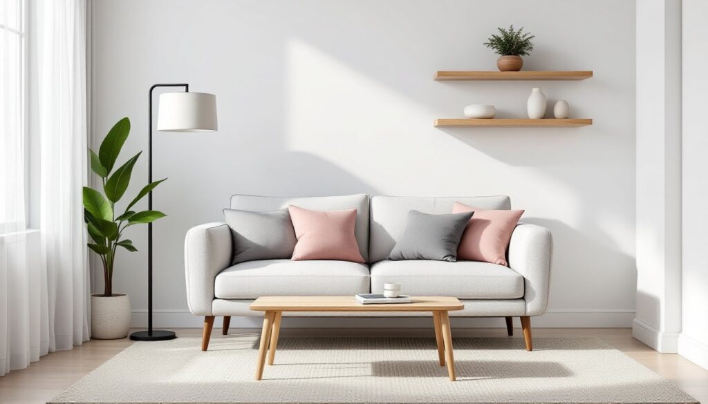
How it works: Position the sofa 12–18 inches from the wall, facing the focal point (TV, fireplace, or window). Anchor it with a rug, 8×10 feet minimum, so the front legs of all seating pieces sit on it. Add a coffee table (round or oval works best in tight spaces) and a pair of accent chairs or poufs opposite the sofa.
Behind the sofa, use the gap for a narrow console table (10–14 inches deep) with lamps or storage baskets. This creates a defined boundary without a physical wall and gives you a surface for lighting or decor.
Why it works: Floating furniture breaks up the boxy feel of a small room. It also improves flow, people can move around the seating group instead of funneling through a single path. The design approach used in many apartment decor layouts relies on this principle to maximize usable square footage.
Trade-off: You lose some floor space in the center, so this layout works best in rooms at least 10×12 feet. Anything smaller and you’ll feel cramped.
The L-Shaped Sectional Configuration
A sectional is one of the most efficient pieces for a small living room, if you pick the right one. Look for a two-piece L-shaped sectional (not a sprawling U-shape) with a chaise or return that tucks into a corner.
Setup: Anchor the sectional in the corner farthest from the entry. The long side should run parallel to the longest wall, with the chaise perpendicular. Keep at least 18 inches between the sectional and any walls to avoid a wedged-in look.
Skip the coffee table or swap it for nesting tables that slide out when needed. A narrow console or sofa table behind the sectional (if it’s floating) adds function without bulk.
Why it works: Sectionals consolidate seating into one footprint, freeing up floor space for other uses. They also eliminate the need for multiple chairs, side tables, and the visual clutter that comes with spreading furniture around.
Choosing the right sectional: Look for models with exposed legs (not skirted bases) and low, track arms. These design details reduce visual weight. Many creative furniture hacks show how modular sectionals can be reconfigured as needs change, helpful if you move or rearrange later.
Drawback: Sectionals dominate the room, so balance them with lighter elements, open shelving, a glass side table, or a wall-mounted TV to keep the space from feeling furniture-heavy.
The Dual-Purpose Zone Layout
This layout splits the room into two functional areas without adding walls or permanent dividers. Common pairings: living area + home office, living + dining, or seating + reading nook.
Execution: Use the back of the sofa or a bookshelf as a visual divider. For example, place a sofa facing the TV with a narrow desk or dining table behind it. The sofa acts as the boundary between zones.
If the room is narrow, orient furniture along the length rather than the width. A loveseat on one end and a small workspace or bistro table on the other creates two distinct zones in a 10×14-foot footprint.
Rugs are critical here, use one under the seating area and a separate smaller rug (or no rug) under the secondary zone to visually separate the functions.
Why it works: Small homes often lack dedicated rooms for everything. This layout lets a single space serve multiple needs without feeling chaotic. The key is keeping each zone’s furniture minimal, one primary piece per area.
Example: A three-seat sofa faces the TV, with a console table behind it doubling as a desk. Add a task chair and a table lamp, and you’ve got a workspace that doesn’t interfere with the living function. Storage ottomans or benches can serve both zones.
Caution: Don’t overfill either zone. The dual-purpose layout fails when both areas are packed to capacity. Pick one primary function and let the secondary use be lightweight and flexible.
The Vertical Focus Layout
When floor space is limited, build up. This layout emphasizes vertical storage and wall-mounted elements to keep surfaces clear and the room feeling open.
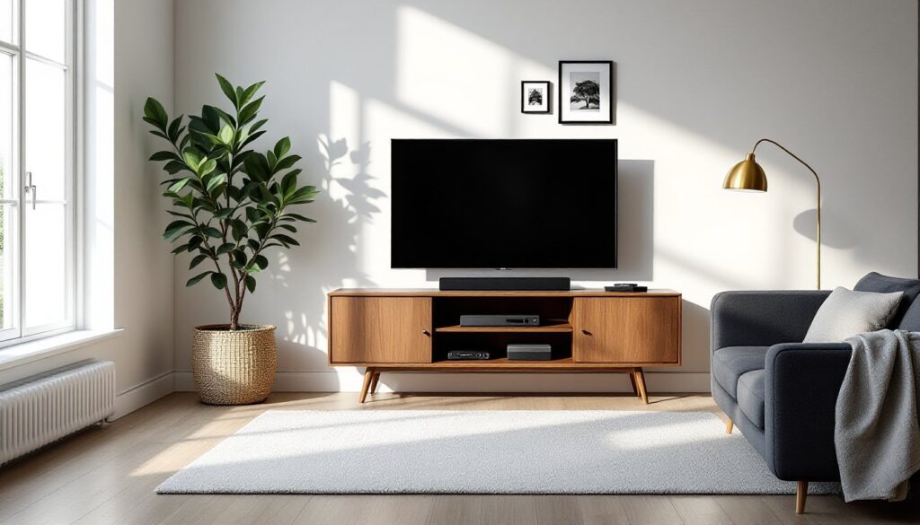
Strategy: Mount the TV on the wall or use a narrow media console (12–16 inches deep). Flank it with floor-to-ceiling shelving or bookcases. These tall units draw the eye upward and provide storage without eating into the room’s footprint.
Keep seating low and streamlined, a three-seat sofa with slim arms and a pair of armless slipper chairs. Swap bulky end tables for wall-mounted floating shelves at arm height beside the sofa.
Lighting plays a big role here. Use wall sconces instead of floor lamps to free up corner space. A pendant or chandelier centered over the seating area adds height and makes the ceiling feel higher.
Why it works: By moving function to the walls, the floor stays open. This makes the room easier to navigate and creates the illusion of more space. Designers featured on interior design platforms often use this approach in condos and urban apartments where every square foot counts.
Implementation tips: Install shelves at varying heights to avoid a rigid, grid-like look. Mix closed storage (cabinets with doors) and open shelving to keep the wall from feeling cluttered. Use the top shelves for rarely needed items and keep everyday stuff at eye level.
Limitation: This layout requires wall anchoring into studs, especially for heavy shelving. If you’re renting or can’t drill, tension-mounted shelves and freestanding ladder bookcases are alternatives, though less stable.
Common Layout Mistakes to Avoid
Pushing everything to the walls. This is the default move in small rooms, but it makes the space feel like a waiting room. Pull at least one piece into the room to create depth.
Oversized coffee tables. A coffee table should be no more than two-thirds the length of the sofa and sit 14–18 inches from the seating. Too big, and it blocks movement. Too far, and it’s useless.
Blocking windows or radiators. Furniture should sit at least 6 inches away from baseboards or heating elements. Blocking a window kills natural light, one of the few free ways to make a room feel larger.
Ignoring the room’s shape. A square room handles symmetrical layouts well. A long, narrow rectangle needs furniture arranged along the length to avoid a bowling alley effect.
Too many small pieces. Five mismatched side tables and a collection of poufs creates visual chaos. Stick to one coffee table, one or two end tables, and maybe one accent piece. Less is more.
Rugs that are too small. A 5×7 rug in a living room looks like a bath mat. The rug should be large enough that at least the front legs of all seating pieces rest on it, 8×10 feet is the standard starting size for most small living rooms.
No defined focal point. Every room needs one, TV, fireplace, large window, or art wall. Arrange seating to face it. Without a focal point, the layout feels aimless.
Conclusion
A small living room isn’t a limitation, it’s a design challenge with clear solutions. Floating furniture, vertical storage, and intentional zoning turn cramped quarters into functional, livable space. The layout should reflect how the room gets used, not just how it looks in a magazine. Measure twice, leave room to walk, and remember that empty floor space isn’t wasted, it’s breathing room.